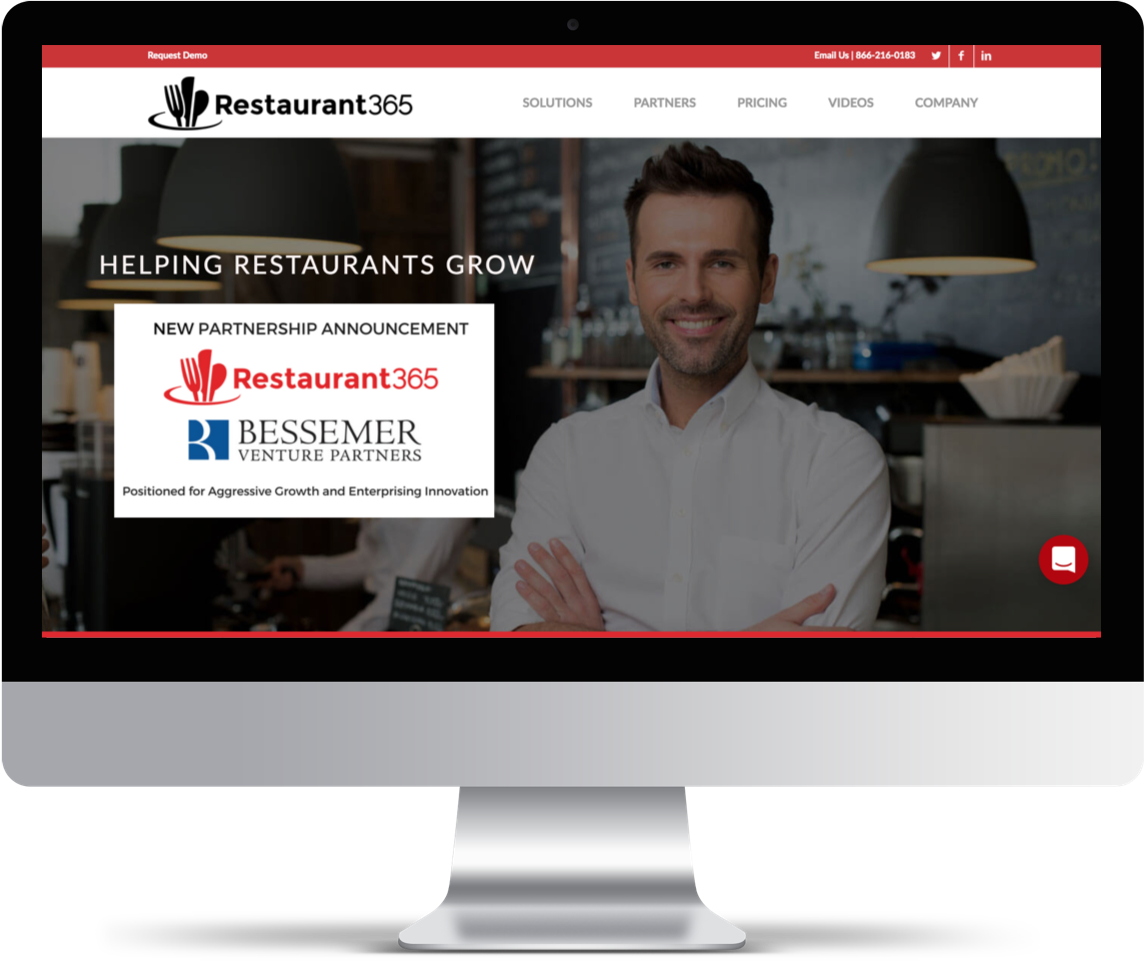
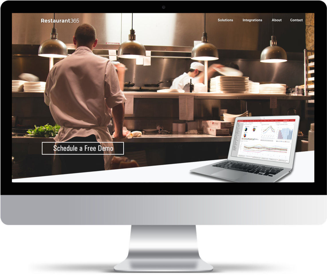
The company’s old website lacked a cohesive brand, content strategy, and site navigation. The goal was to give R365 a consistent look and feel and to effectively communicate to their audience the services they provide. We partnered with a development group to help bring the new vision to life on a WordPress platform. Our main goals are as follows:
1. Create a cohesive brand strategy for the website and other digital collateral.
2. Consolidate and rearchitect the site so that the structure, navigation and user flows make sense from a usability perspective.
3. Optimize assets and utilize interaction design to bring life to the site without bogging it down.
4. Ensure marketing and support strategy is routed to appropriate channels.
Restaurant365 targets key players in the restaurant industry.

This user needs access to back-office tools to manage scheduling, inventory and track restaurant performance.

As an accounting professional, this user needs to be able to track expenses, keep books, manage payroll etc.
Through the use of dynamic imagery, videos and a clean and responsive layout, we were able to accomplish our goals of modernizing and simplifying the R365 brand.
I teamed up with a copywriter colleague of mine to define the content strategy. After researching competitors and assessing the business goals, we collaborated over a white board session and redefined the sitemap, information architecture and communication strategy for the website overhaul.
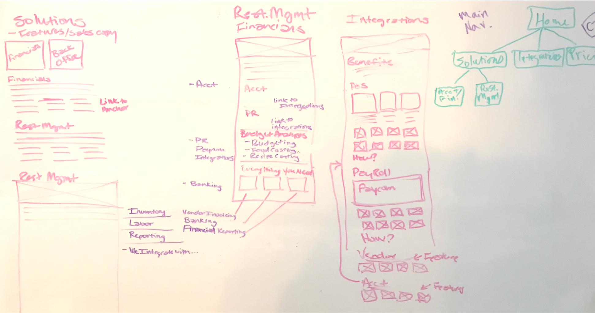
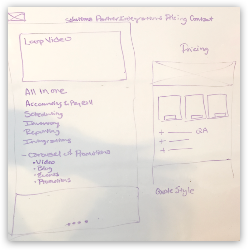
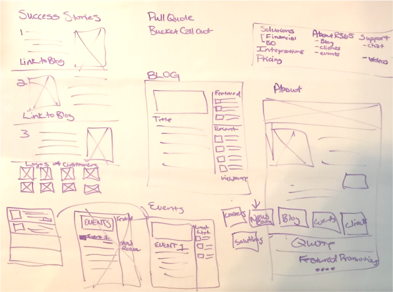
This part of the process is my favorite. We sit down and really deep-dive what we are trying to achieve through sketches, trial and error and develop a scalable solution for the product.
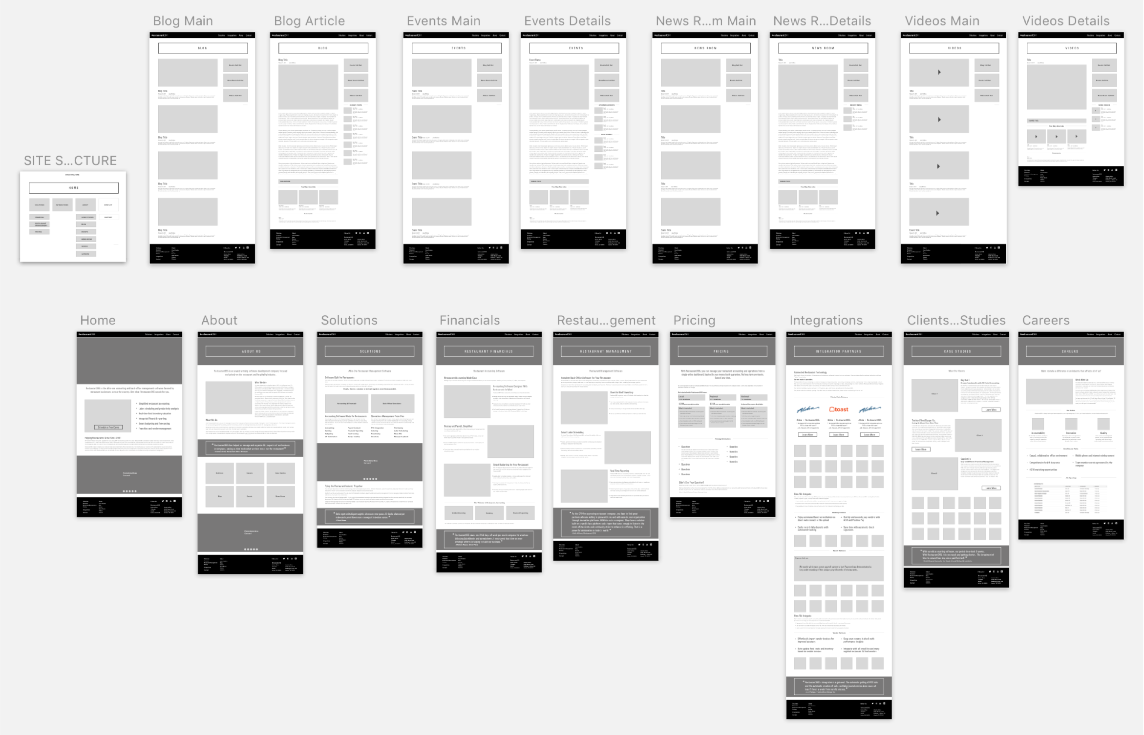
After we developed a basic strategy, I took our findings and generated wireframes using sketch so that I could present the new strategy to the client. After a client meeting, we made a few content revisions to better explain their features and new pricing model.
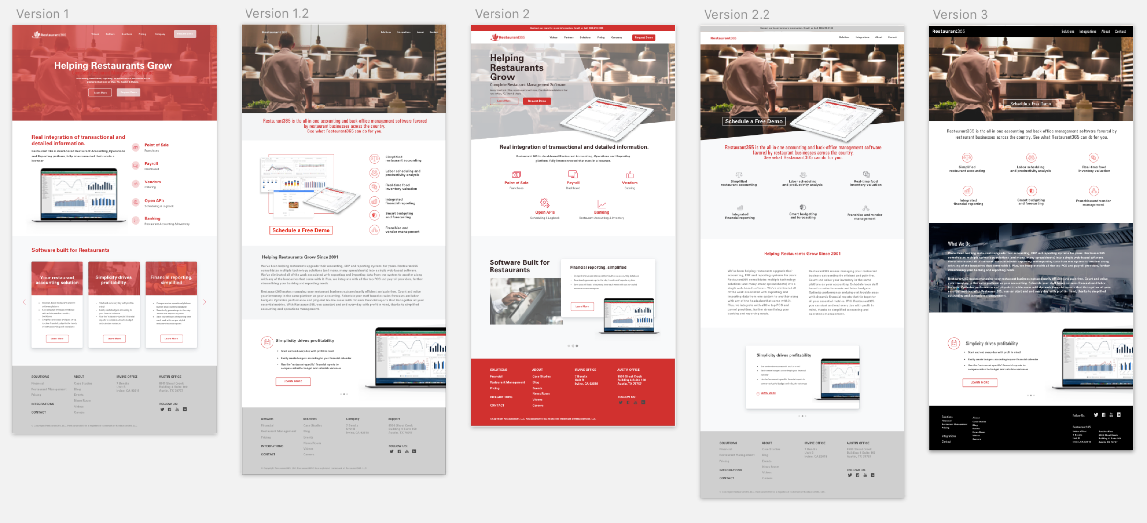
After the finalization of the new content strategy and site architecture, I consulted with another UX/UI colleague of mine to start the design process. We put together several variations of what a home page might look like to help define the visual aspects of the new brand strategy.
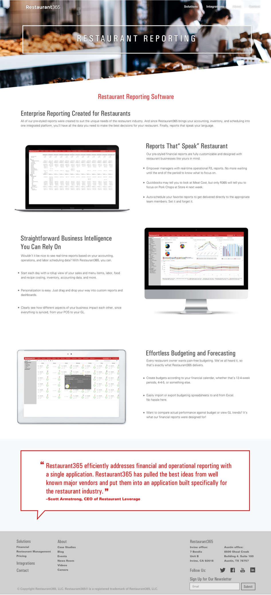
I constructed each page to reflect the clean and dynamic feel of the new brand strategy while maintaining cohesiveness through the use of design elements, imagery and interaction design. I created a prototype through the use of Invision so that the client could make comments and provide feedback throughout the UI Design process.

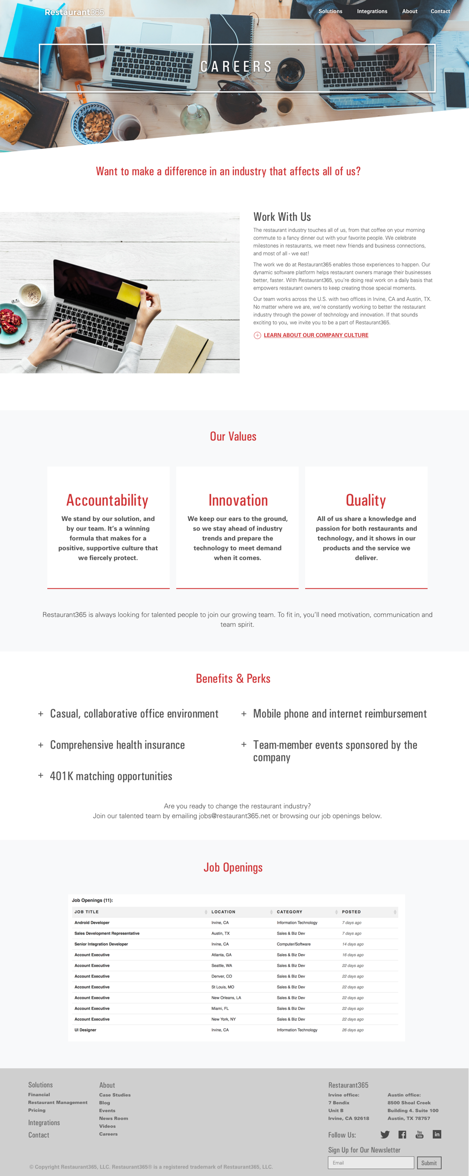
Once the UX/UI portion of this website was finalized, we passed it off to development and oversaw that process to ensure full quality control. This website launched on time in the spring of 2018.