We needed to convert the Wi-Fi Management web application to a responsive framework so that AT&T Field Technicians and client sites could view the system on a tablet and iPhone and manage their Wi-Fi Networks on the go.
1. Allow AT&T Field Technicians and clients to manage their Wi-Fi networks on multiple devices.
2. Convert fixed-width application to scale responsively.
3. Allow users to access all vital information regardless of screen size.
Two different user views were designed to suit the needs of each design target.

This admin level user needs a full view of a client's system in order to troubleshoot, manage and back up their clients' Wi-Fi networks. They also need to be able to view multiple sites in order to help detect and help repair outages, view trends nation-wide and alert users of any issues they may be experiencing.

This tech user manages the individual site Wi-Fi networks for their designated corporations. They need to be able to see who is on the network, assign values for payment type and troubleshoot system issues in order to maintain a healthy Wi-Fi status.
When we started the design process there were knowns and there were unknowns. We worked from our certainties and standard UX patterns to determine where to put breakpoints and how the UI would scale for our knowns and conducted research and tested our design targets to explore new patterns for unknowns. The UX team (myself and 1 other designer) had to take into consideration development needs in addition to user needs and flows. We provided the developers with pixel perfect comps, redlines as well as comprehensive documentation to define interactions and UI guidelines.
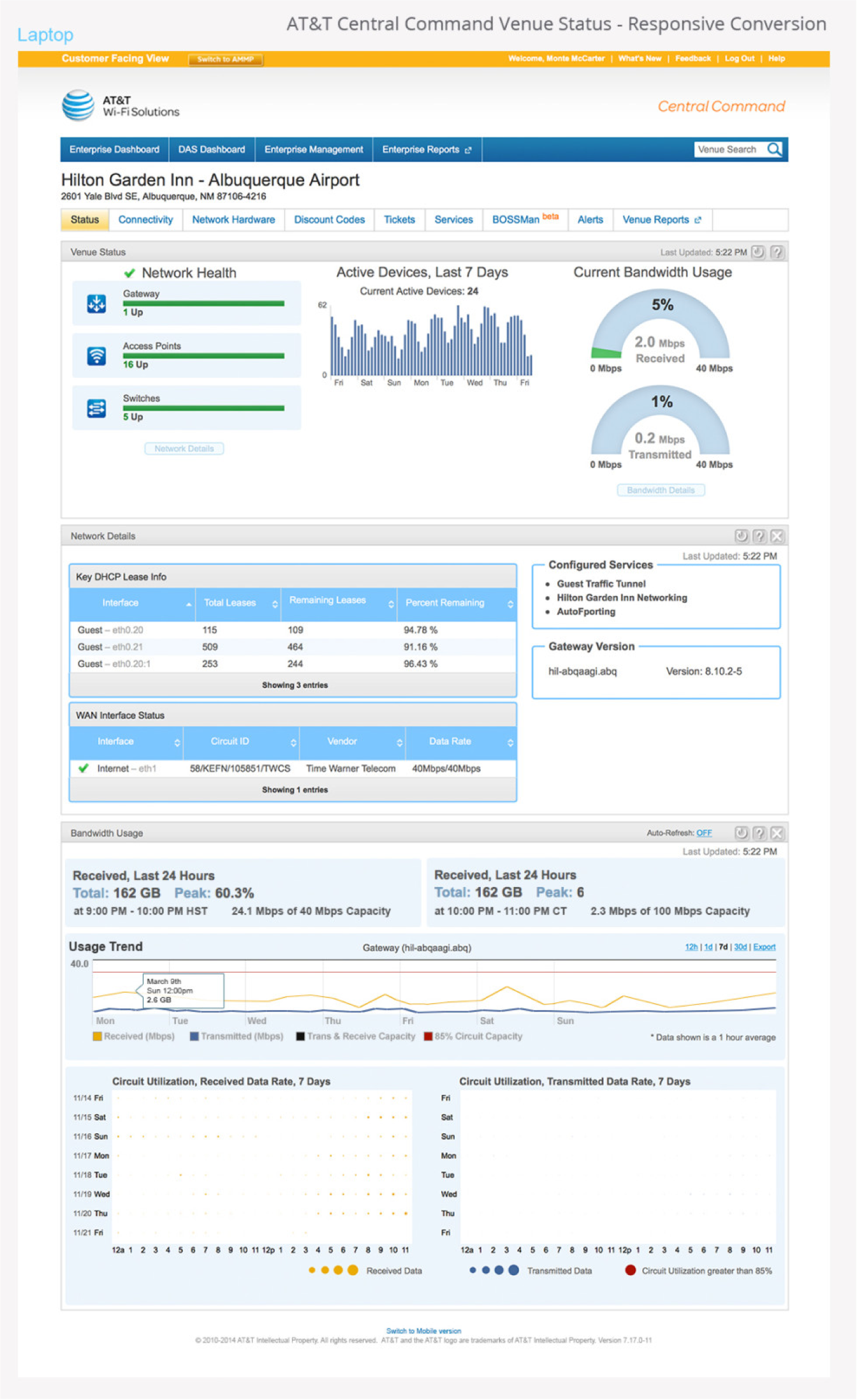
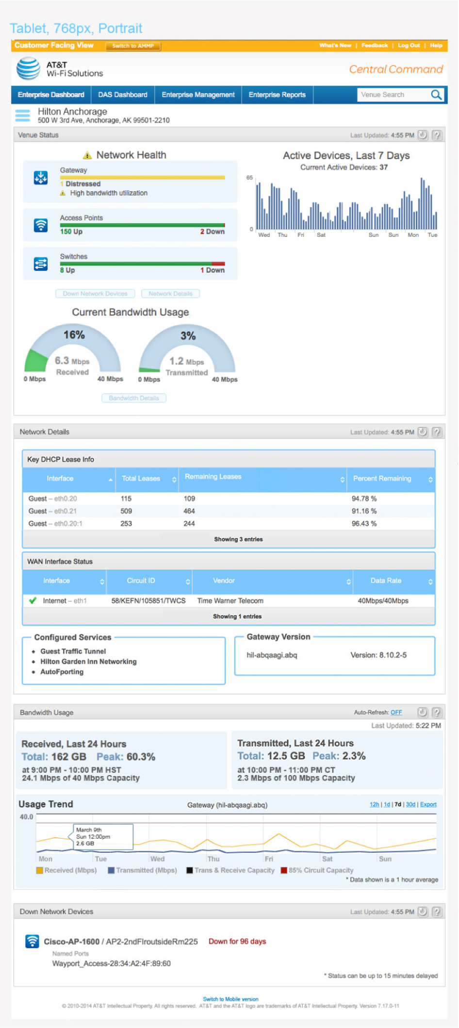
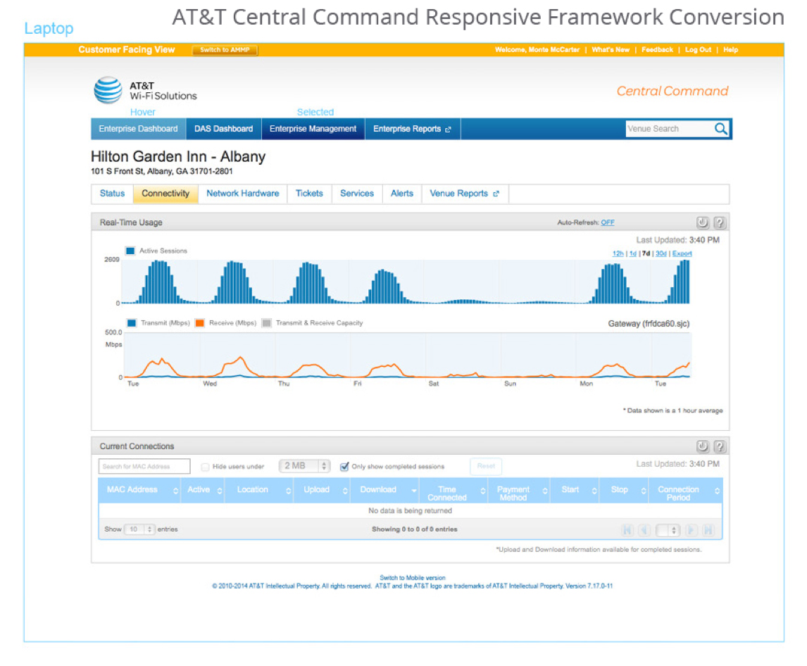
The fixed width for the modules was initially designed at 980px. We needed to devise a cost efficient solution in order to accommodate the larger upcoming screen sizes and retina displays on various devices. The result would yield a visual gap along side of the modules while the navigation and headers scaled.
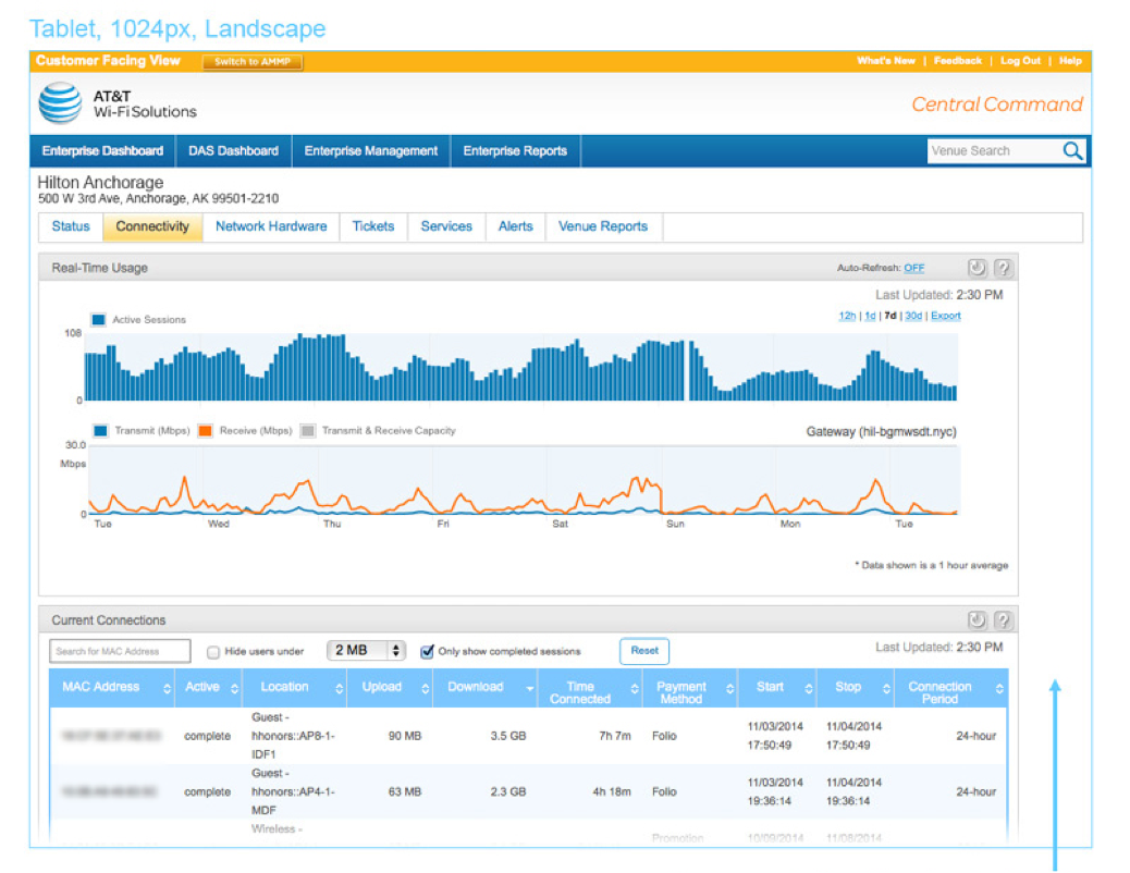
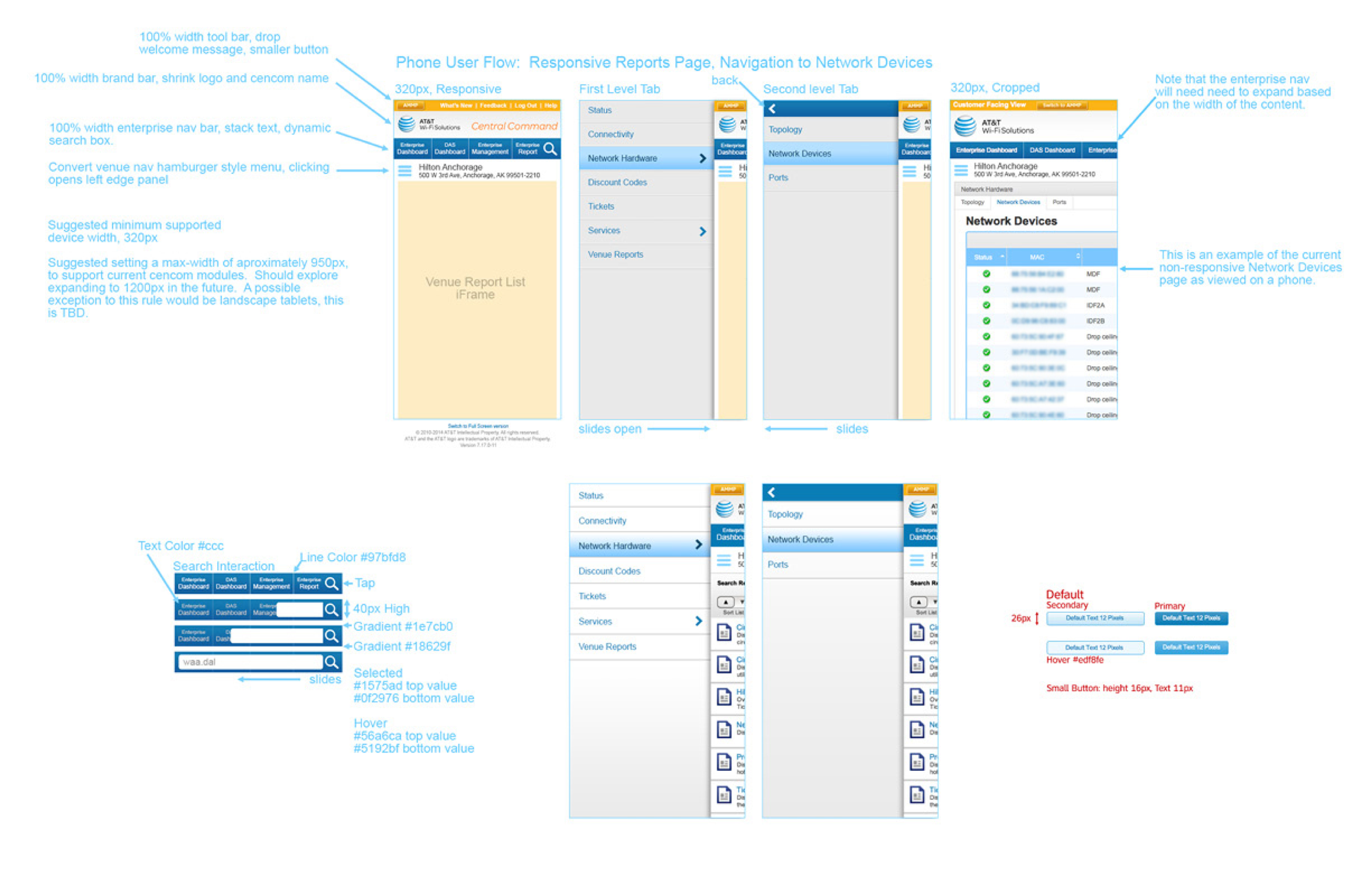
Another design challenge we faced was converting all of the relevant data shown on a full-screen module on a mobile device. This took considerable reconfiguration and testing with our design targets to ensure users could easily access the information they needed in order to complete various tasks and use cases.
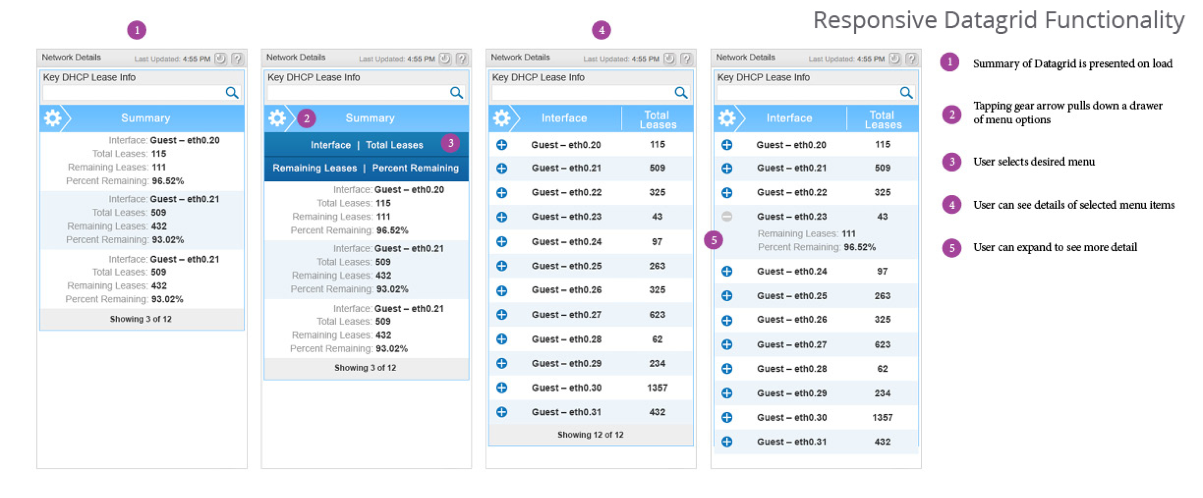
Because this was not a mobile first exercize, we conducted multiple rounds of user interviews and testing with our design targets to understand how they used datagrids.
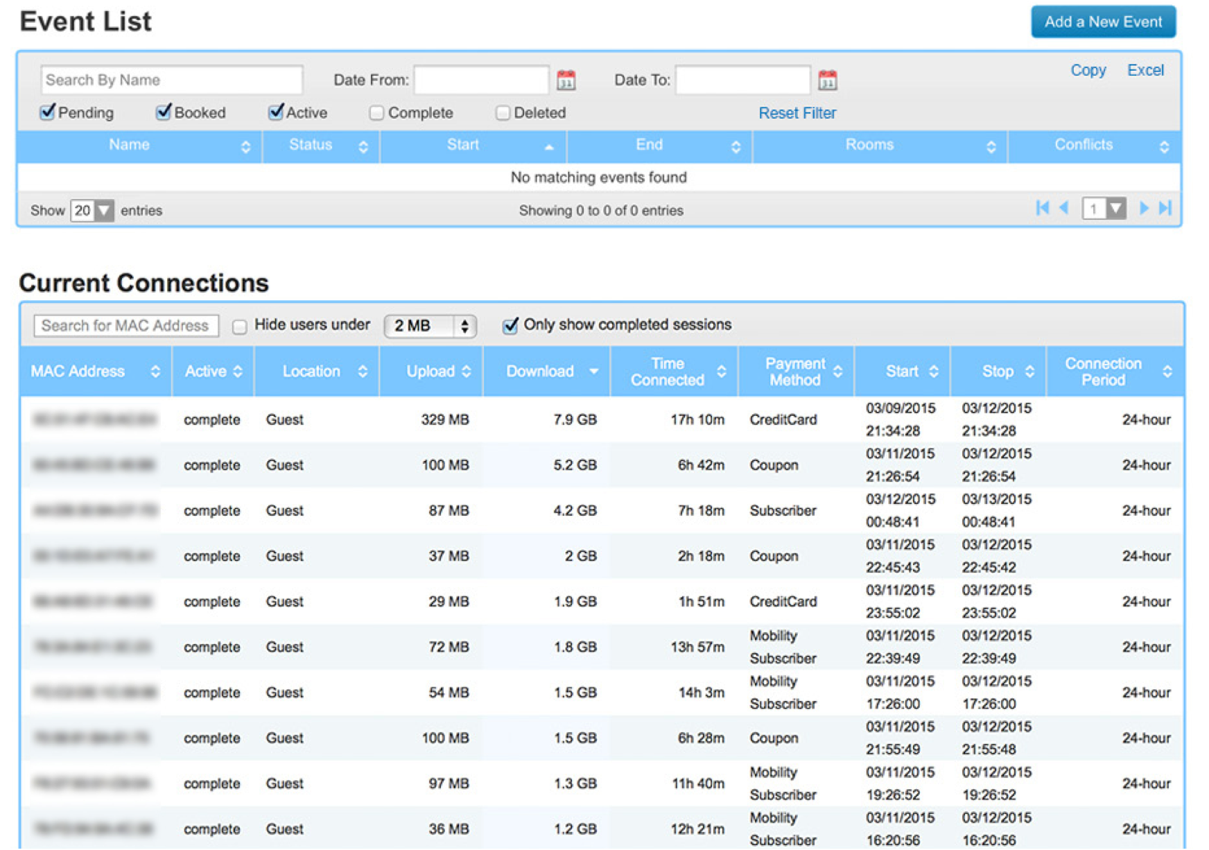
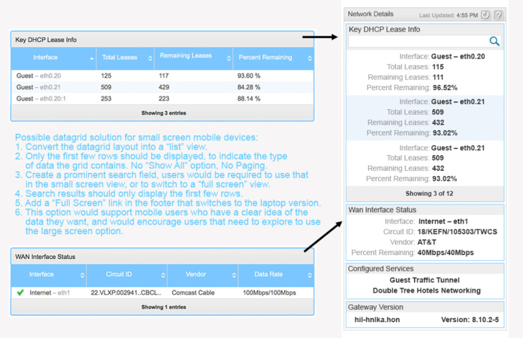
We explored several options of existing patterns to find a solution that was both user friendly and provided the relevant data for the techs to be able to perform certain tasks. We eventually created a hybrid solution of some of the best standard practices at the time.
In addition to providing the standard mobile responsive documentation and functionality, we defined how each module would scale across the board.
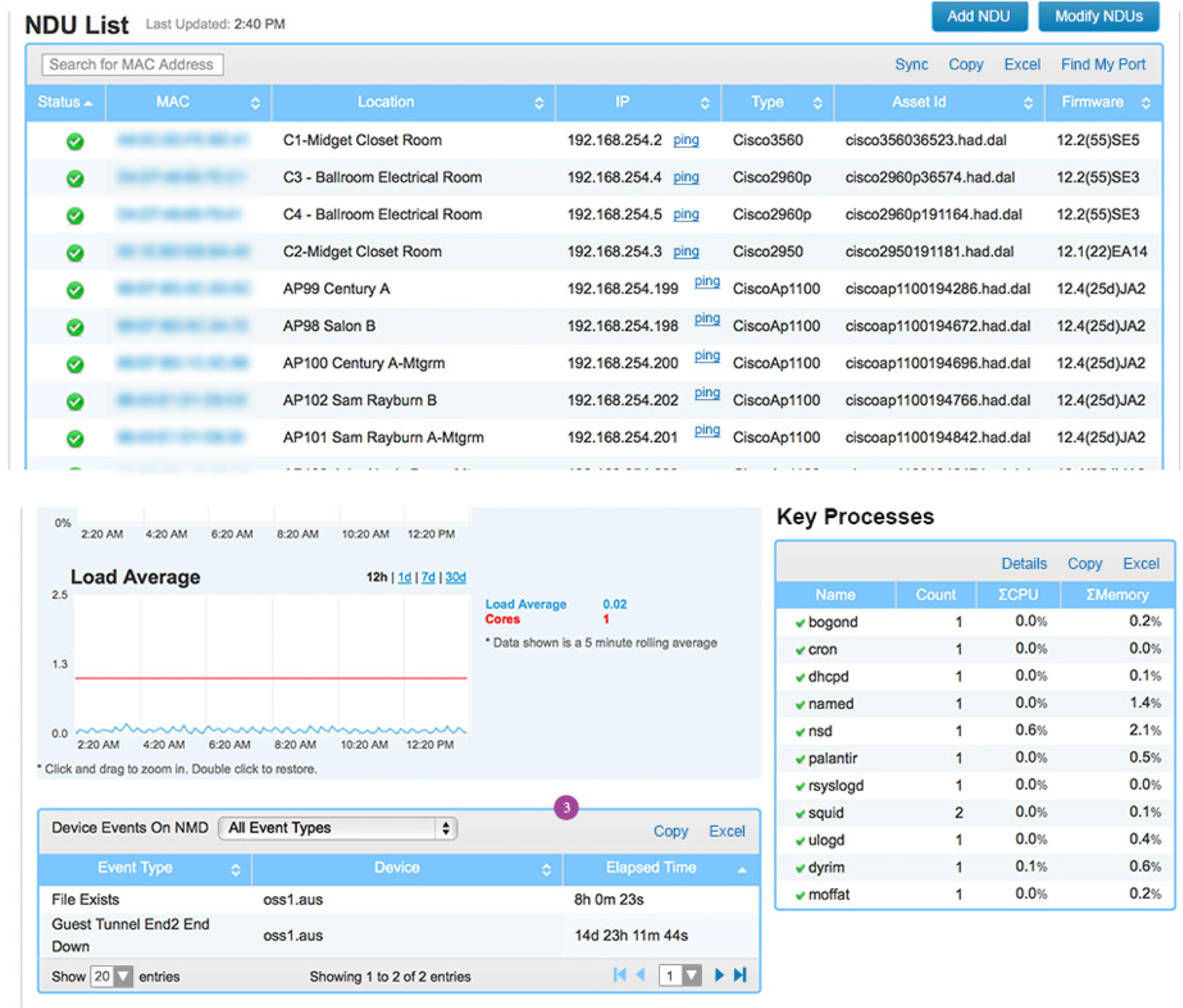
We opted for a drawer functionality for the navigation system with an expanding search box. Extensive documentation was provided to the development team to communicate interaction and design specs. We worked agile with the dev team and met daily to monitor progress and ensure design standards were met.
This product was iterative and launched in phases in order of priority according to the product roadmap and feature importance. Making the framework responsive was a move toward keeping the product relevant and helped accommodate the ever-growing trend of mobile device usage.