We created a landing page and sign up flow for SMBs.
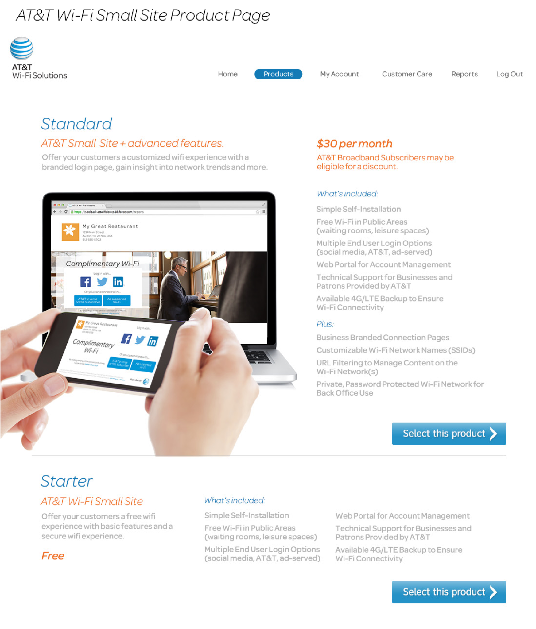
1. Create marketing landing page that communicates the Wi-Fi solution to SMBs.
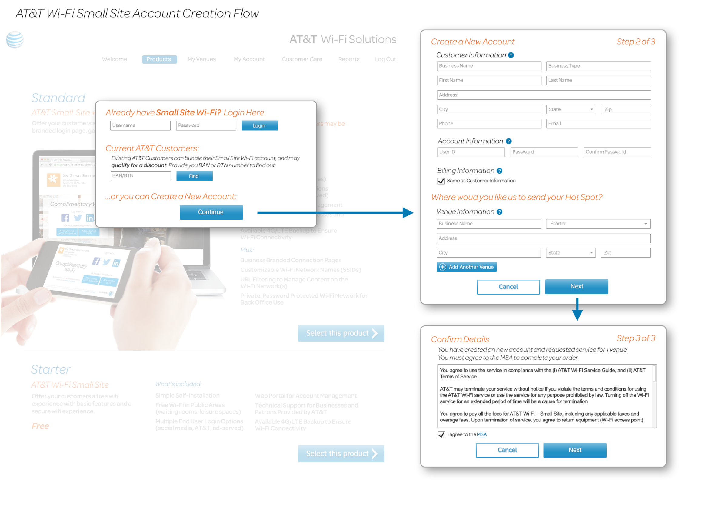
2. Incorporate sign up flow and streamline end-to-end process complete with hardware shipment, installation and setup.
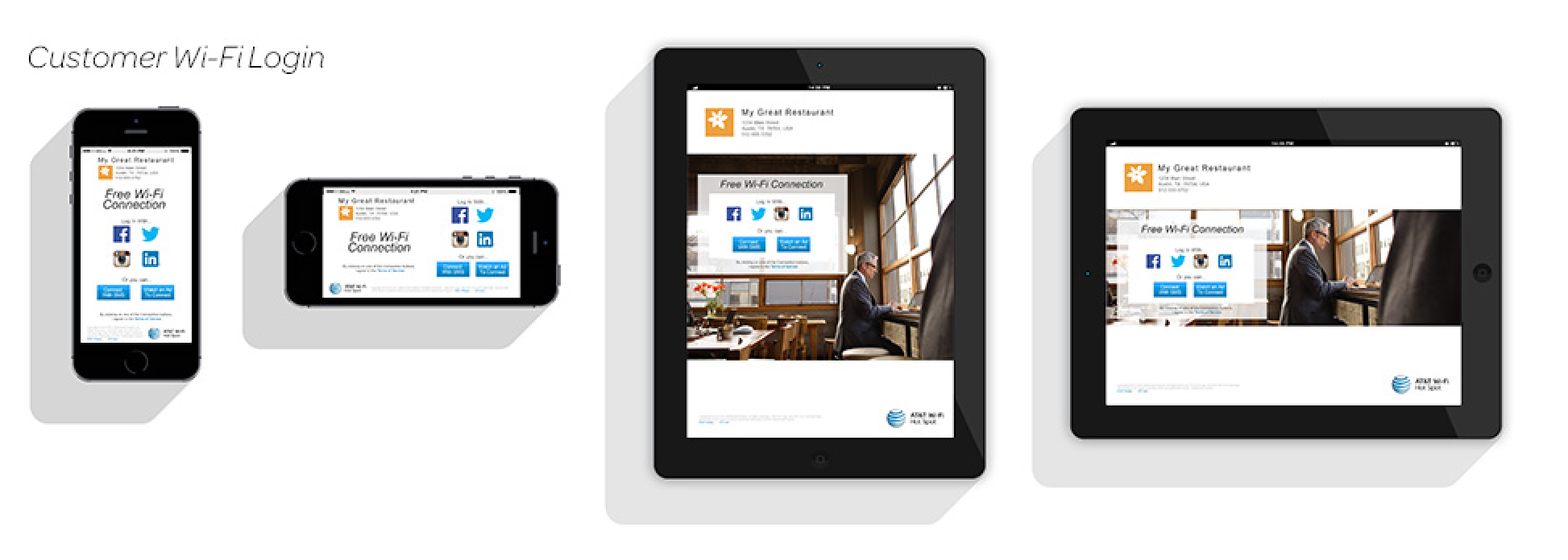
3. Design flow and white-label pages for store customers connectivity.
4. Incorporate user dashboard for SMBs to view data visualization.
Two different user views were designed to suit the needs of each design target. Small & Medium Businesses, and Store Customers.

Specifically we targeted Small and Medium Businesses looking to provide Wi-Fi to their customers.

End user looking to access store Wi-Fi on their laptop or mobile device.
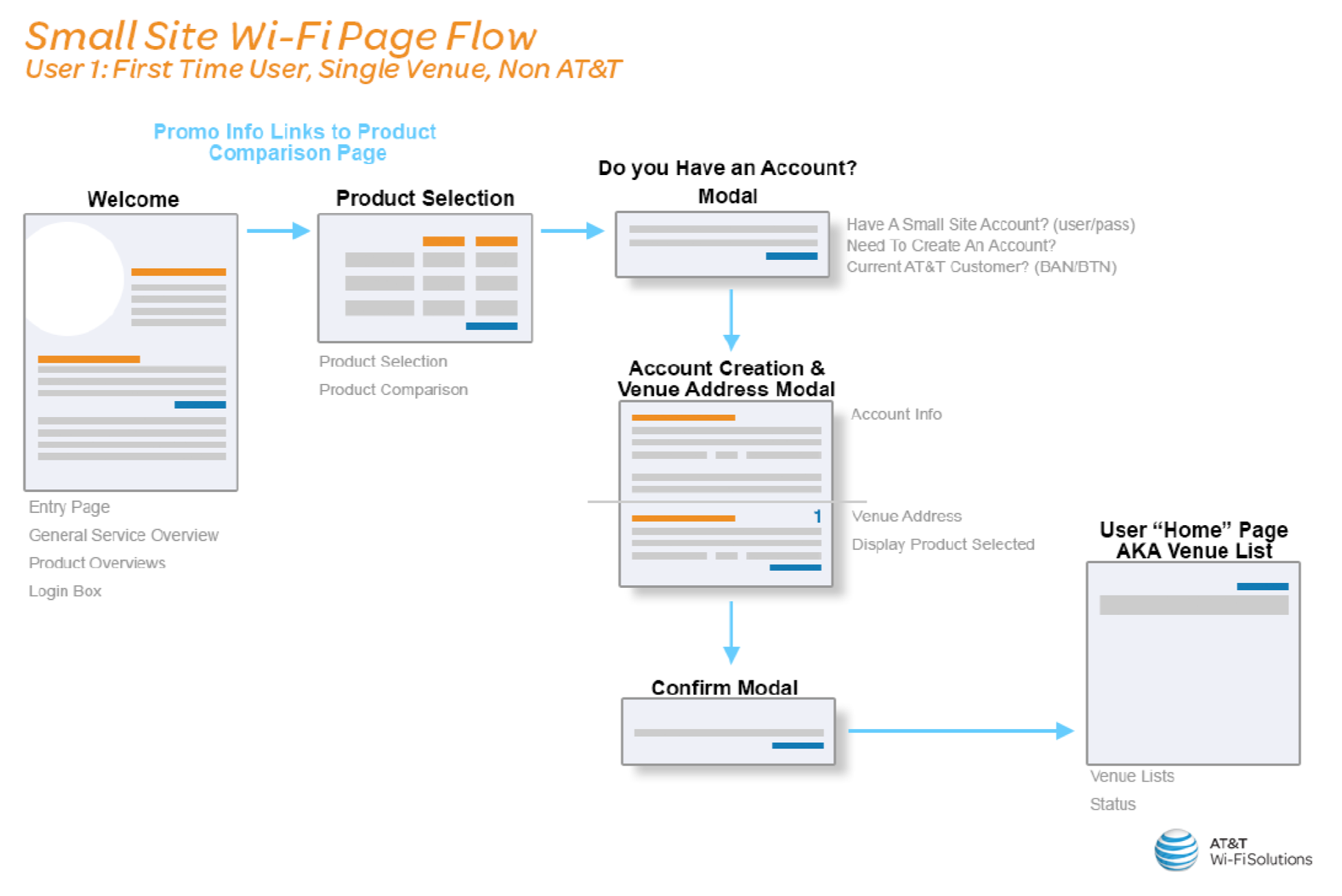
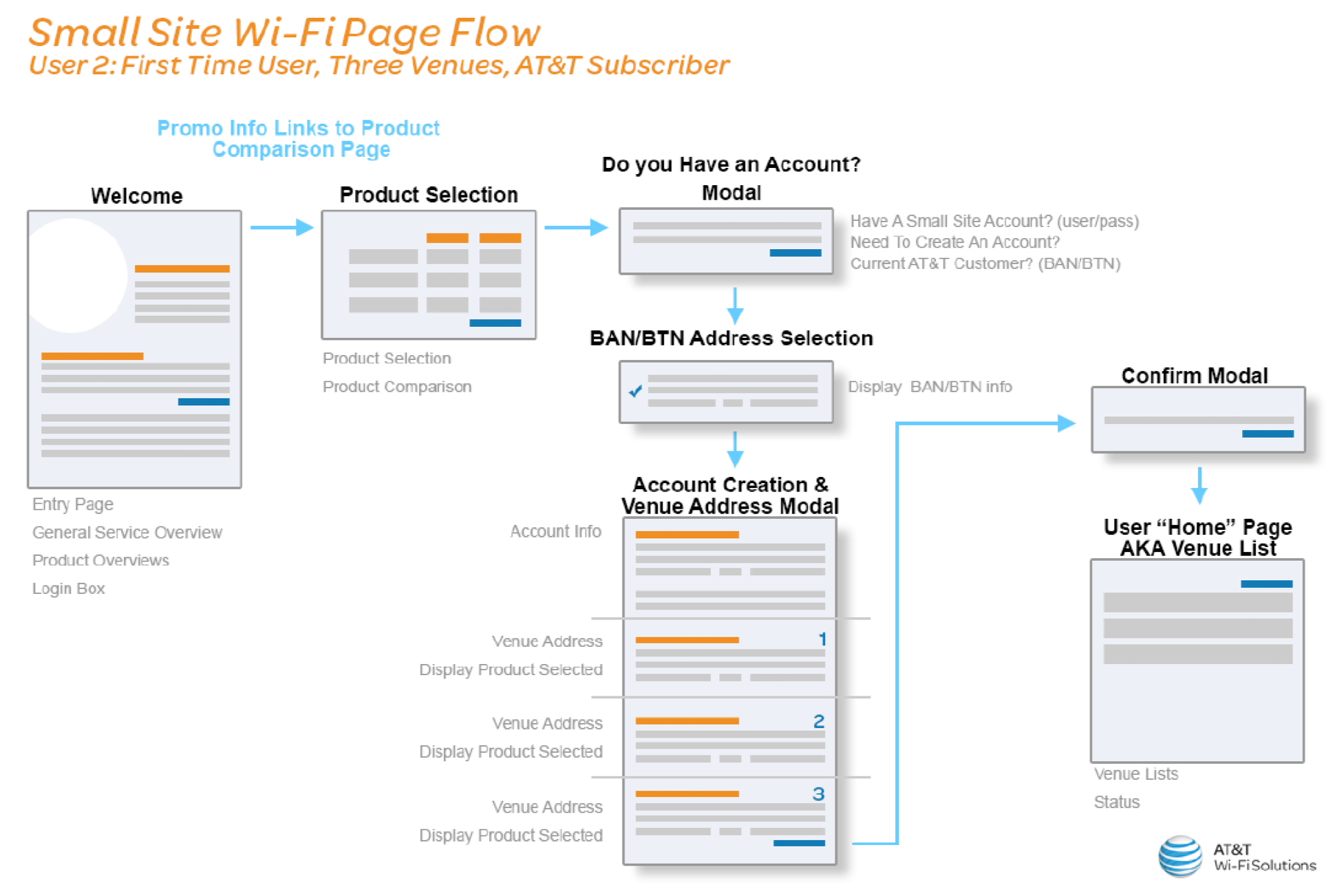
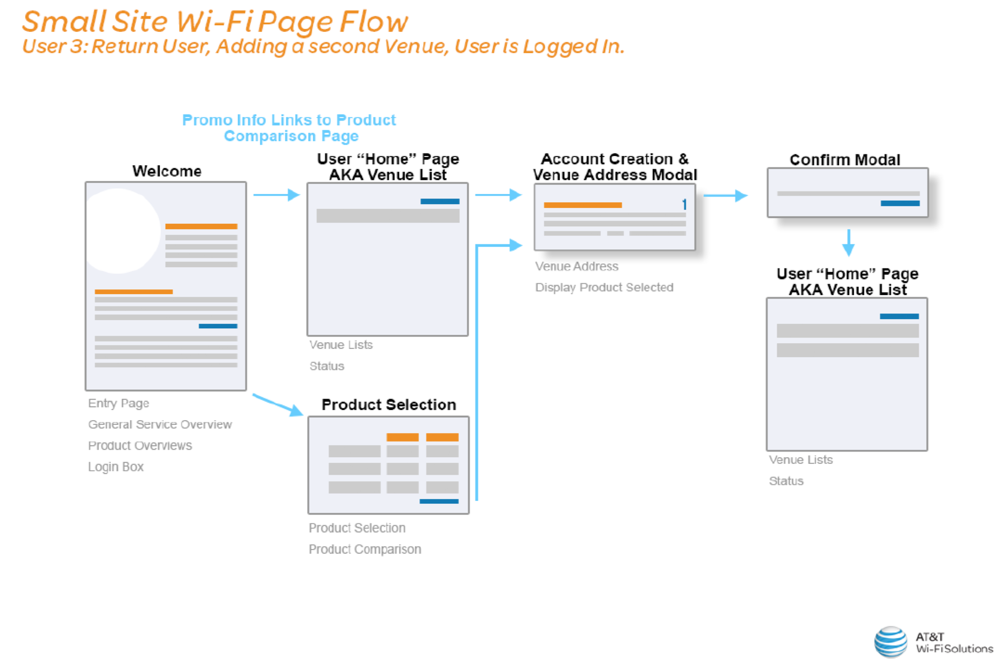
We put together 3 sign-up flows based on several variables and assumptions of our SMB target. Flows demonstrate whether or not the user is a first-time AT&T user and has a Wi-Fi account, how many venues or store locations the user is adding to the account, and whether or not the user is logged in to their account.
1. First time user with a single store location and does not have an AT&T Wi-Fi account.
2. First time user looking to add multiple venues, currently has an AT&T Wi-Fi account and isn’t logged in.
3. Return user looking to add additional venues and is currently logged in to their AT&T Wi-Fi account.
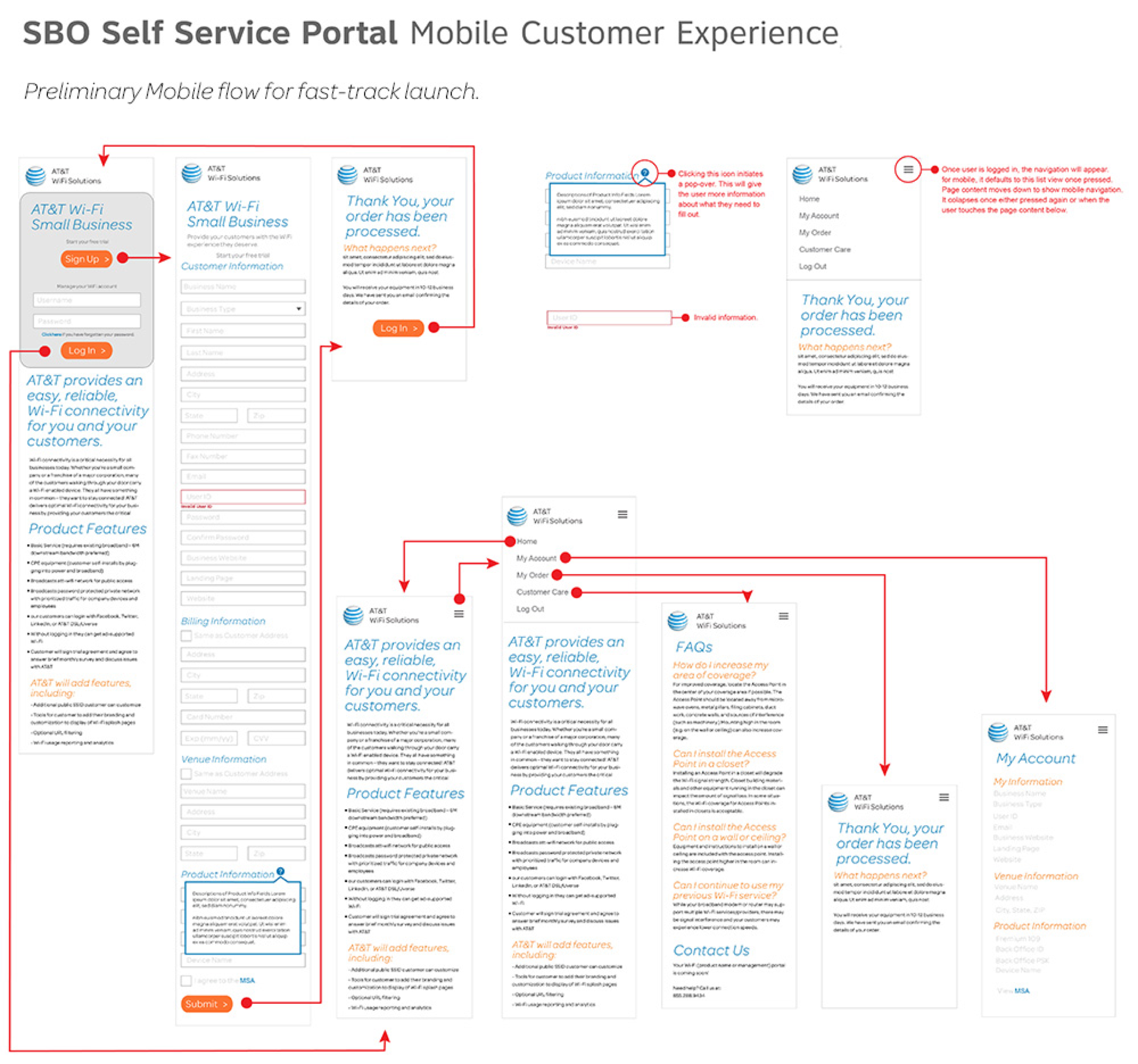
Documentation provided for mobile UI with interactions, content and flow.

Product Page
These solutions were launched as a beta in the Spring of 2015 and marketing efforts and product improvements continued throughout the next year.